Intro to Data Analysis
Data Visualization
For more advanced data analysis options
- Jupyter notebook with pandas, numpy, matplotlib, seaborn and dash as the interactive portion.
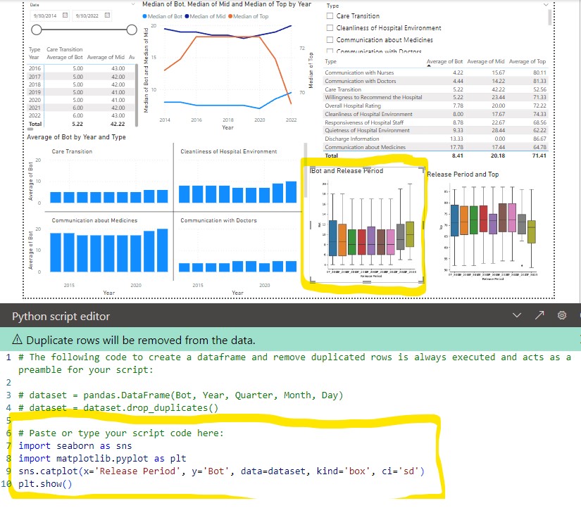
- Power BI (microsoft windows based). Can import data from databases, csv, JSON, etc and do basic plotting with microsoft tools. Can add R/Python scripts to do more advanced box plots, histograms, heat maps, etc with plotly.
- dash is Python based dashboard using plotly to do advanced box plots, histograms, heat maps.
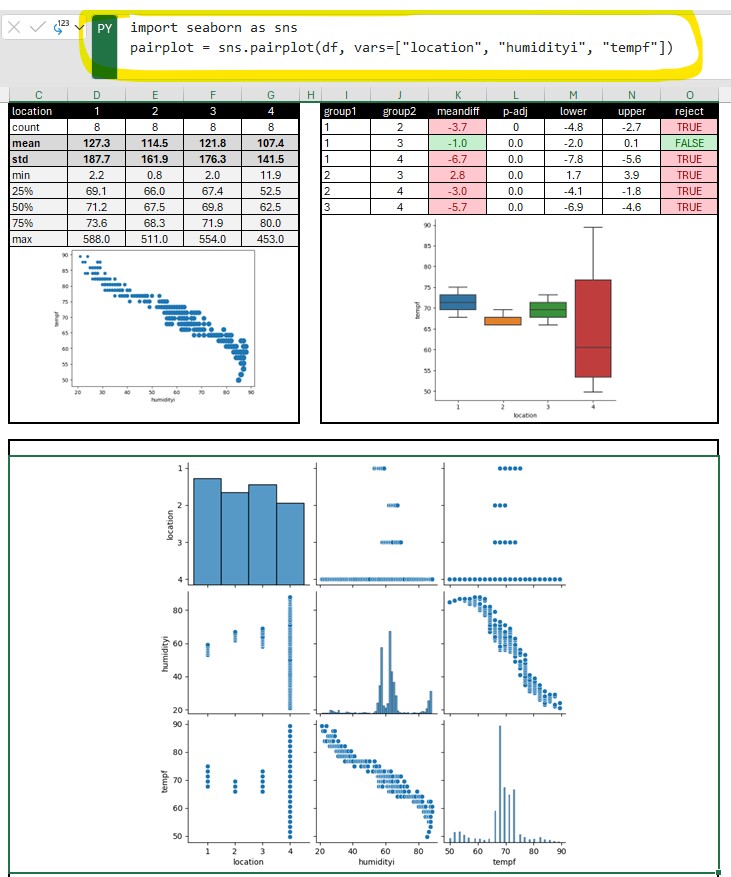
- Python in excel allows you to enter python code in an excel formula bar and execute it. You can then output the plot or table into your spreadsheet. An advantage of this is you can leverage off pandas to quickly duplicate/transform data tables without changing the original data. You also have access to the python statistical functions. Also if you already have python/jupyter/dash code for reports you can now copy these into excel (or Power BI).
- streamlit is a quick and easy data visualizations.
Pandas
Pandas is a python library (built on top of NumPy) that provides a tabular structure to your data for most of the advanced data visualization tools. Typically one of the first steps you will do is import your data from a database, spreadsheet, or csv into a pandas dataframe. From here you can easily duplicate the dataframe, modify, create pivots, format columns, add data, etc. An advantage of this is you can easily/quickly transform your data without affecting your original database.
 df = pd.DataFrame(client.query_api().query_data_frame('from(bucket: "esp2nred") |> range(start: -5d) |> pivot(rowKey:["_time"], columnKey: ["_field"], valueColumn: "_value")'))
    df = df.drop(columns=['result', 'table', '_start', '_stop', '_measurement', 'device'])
    df = df.assign(date=df['_time'].dt.strftime('%Y-%m-%d'))
    df['date'] = pd.to_datetime(df['date'])
Results = multi.pairwise_tukeyhsd(df['tempf'], df['location'], alpha= 0.05)  # Use multi pairwise tukey HSD
dftukey = pd.DataFrame(data=Results._results_table.data[1:], columns=Results._results_table.data[0])
dftukey['reject'] = dftukey['reject'].astype(str)
table_tukey = dbc.Table.from_dataframe(dftukey, striped=True, bordered=True, hover=True) # use bootstrap formatting on table
# Create summary dataframe with statistics
dfsummary = df.groupby('location')['tempf'].describe()  # describe outputs a dataframe
dfsummary = dfsummary.reset_index()  # this moves the index (locations 1,2,3,4) into a regular column so they show up in the dash table
'''dfsummary.style.format({   # this would work if the values were floats. However they
    "mean": "{:.1f}",         # were strings after the describe functions so had to use
    "std": "{:.1f}",          # the map function below
})'''
dfsummary.loc[:, "mean"] = dfsummary["mean"].map('{:.1f}'.format)  # format as float. see comment above
dfsummary.loc[:, "std"] = dfsummary["std"].map('{:.1f}'.format)
dfsummary.loc[:, "50%"] = dfsummary["50%"].map('{:.1f}'.format)
dfsummary = dfsummary.set_index('location').T.rename_axis('location')
dfsummary = dfsummary.reset_index()
print(dfsummary)
table_summary = dbc.Table.from_dataframe(dfsummary, striped=True, bordered=True, hover=True) # use bootstrap formatting on table
A Pandas DataFrame is a two-dimensional data structure that can store data of different types. A Pandas Series is a one-dimensional data structure that can only store data of one type.
Feature DataFrame Series Data type Two-dimensional One-dimensional Data types Can store data of different types Can only store data of one type Index Can have an index Must have an index Columns Can have columns Cannot have columns Slicing Can be sliced by rows and columns Can only be sliced by index Iteration Can be iterated over by rows and columns Can only be iterated over by index Merging Can be merged with other DataFrames Cannot be merged with other Series Sorting Can be sorted by rows and columns Cannot be sorted by rows and columns Groupby Can be grouped by rows and columns Cannot be grouped by rows and columns Reshaping Can be reshaped into different data structures Cannot be reshaped into different data structures
Matplot/Seaborn
Using fig, ax = plt.subplots() creates a figure and set of subplots
- fig is the window that contains the plot(s). Can be used for adjusting the size of the fig and saving to image file
- ax is the axes of the figure. Allows to manipulate the x and y axes.
Figure level function
displot and catplot return a FacetGrid. When columns are added the figure itself will become wider (subplots will have same size and shape). FacetGrid is an object managing one or more subplots that correspond to conditional data subsets with convenient methods for batch-setting of axes attributes.
Seaborn empirical cumulative distribution plot
g = sns.displot(df, x="Defects", hue="Tool", kind="ecdf")
g.set(xlim=(0,50),ylim=(0,1))
plt.title("Defects by Track")
plt.grid(g)
plt.show(g)
Python In Excel
Python in excel allows you to enter python code in an excel formula bar and execute it. You can then output the plot or table into your spreadsheet. An advantage of this is you can leverage off pandas to quickly duplicate/transform data tables without changing the original data. You also have access to the python statistical functions. Also if you already have python/jupyter code for reports you can now copy these into excel (or Power BI).

Jupyter Notebook
Jupyter Notebook can be installed separately or easily started from anaconda in either windows, mac, or linux. Jupyter uses IPython as a backend (IPython is a dependency of Jupyter). It is a interactive Python interface usually using a web front end.
The ipykernel package provides the IPython kernel for Jupyter. But you can manually create a venv and install it for usage in Jupyter. See Python venv
For VS code to work with Python in Jupyter Notebooks you need to activate an Anaconda environment in VS Code or another Python venv in which the Jupyter package has been installed. (and there is Jupyter extension for vs code) If you don’t want to use Anaconda then (.venv) python3.10 -m pip install jupyter will install the Jupyter system, including the notebook, qtconsole, and the IPython kernel.
Once inside Jupyter Notebook. Example Jupyter flow
from IPython.display import display
import pandas as pd
import numpy as np
from matplotlib import pyplot as plt
import seaborn as sns
df = pd.read_csv("data.csv")
pivoted = pd.pivot_table(df, values='data', index=['file', 'sample', 'sensor'], columns = ['type']).reset_index()
pivoted.groupby(['file']).mean().round(1).drop(['sensor', 'ave', 'delta', 'raw'], axis=1)
pivoted.groupby(['file']).describe().round(1).drop(['sensor', 'delta', 'raw', 'ave'], axis=1)
# Use melt to unpivot
comparedf = pd.melt(pivoted, id_vars=['file', 'sample', 'sensor', 'delta', 'time'], var_name='stat')
a = sns.catplot(x='stat', y='value', col='file', data=comparedf, kind='box', ci='sd')
plt.show()
b = sns.catplot(x='stat', y='value', data=comparedf, hue='sensor', col='file', kind='strip')
# More seaborn options
fig,axs = plt.subplots(1,2, sharex=False, sharey=False, squeeze=True)
g = sns.boxplot(x='file', y='time', data=pivoted, ax=axs[0])
#g.set(ylim=(1500, 2250)) g.set_title('ADC Time') g.set_ylabel('time (ms)')
#plt.title('ADC Average')
#plt.ylim(1500, 2250)
#h = sns.boxplot(x='file', y='raw', data=pivoted, ax=axs[1])
#h.set_title('ADC Raw') #plt.title('ADC Raw')
#plt.ylim(1500, 2250)
#h.set(ylim=(1500, 2250))
#h.set_ylabel('raw')
plt.show()
# Histogram
pi0df = pivoted[pivoted['file'] == 'pi0']
esp32df = pivoted[pivoted['file'] == 'esp32']
sns.distplot(pi0df[pi0df['sensor'] == 0].raw, label='pi0-ch0')
sns.distplot(pi0df[pi0df['sensor'] == 1].raw, label='pi0-ch1') sns.distplot(esp32df[esp32df['sensor'] == 0].raw, label='esp32-ch0') sns.distplot(esp32df[esp32df['sensor'] == 1].raw, label='esp32-ch1')
#fig.legend(labels=['pi0-ch0','pi0-ch1','esp32-ch0','exp32-ch1'])
plt.legend()
plt.show()
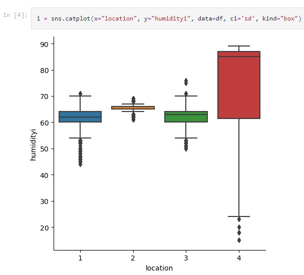
# Seaborn categorical plot. kind="box"
i = sns.catplot(x="file", y="time", data=pivoted, ci='sd', kind="box")

Google Colab
Google colab is very similar to Jupyter Notebook. It is useful for ML since many of the libraries are pre-installed. Can use google drive to store project code. colab
Dash-plotly
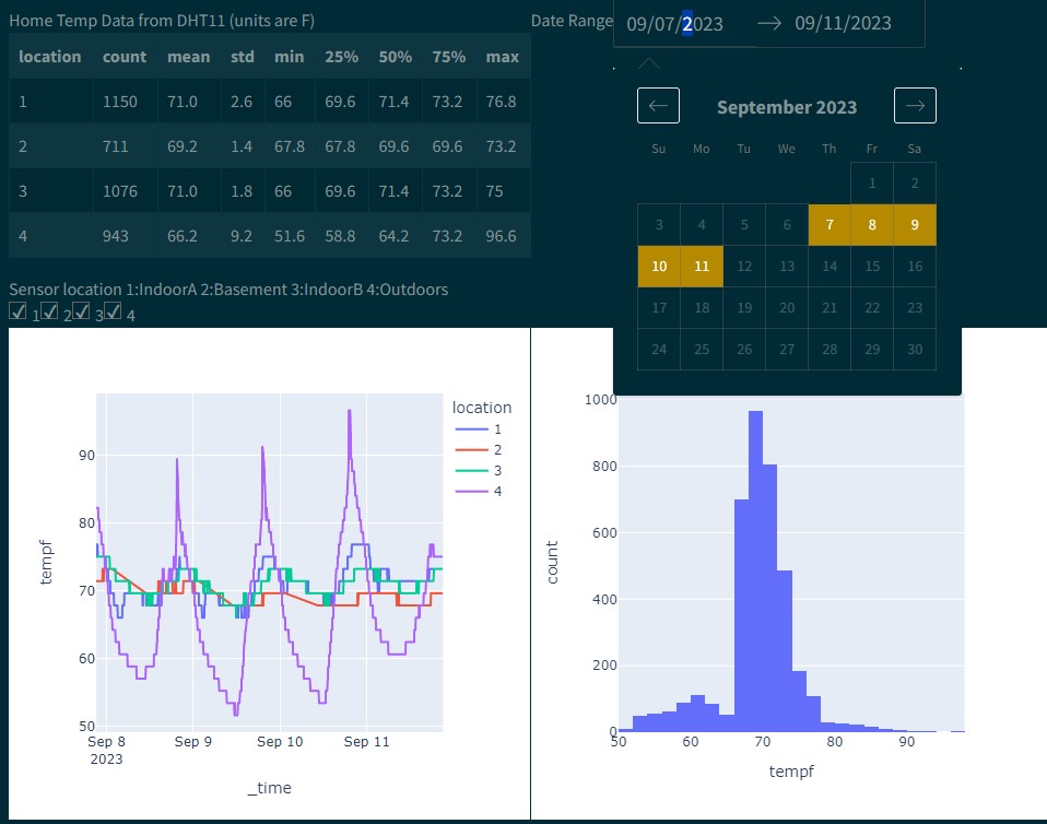
Dash gives more GUI type functions, ie letting a user toggle data series on/off while plotting.
$ python3 -m pip install dash
You will create a file called app.py that contains the dash/plotly code.
When you run
$ python3 app.py
It will create a link to view the charts in your browser
Primary components
(initial chart can be plotted with steps 1-3 alone)
- Load css and create dash object
- Define figures (charts. ie fig = px.histogram(df, x=”values”, nbins=1 ), optional text string (markdown), functions(ie to show the data/df)
- Layout (see below.. will use html and core components)
- Callbacks (not required but can be used for interactive charts)
More details
- Layout is a hierarchical tree (dash_html_components)
- Use html components (classes for HTML tags) to create the layout (ie html.DIV, style, etc).
- To place charts use dash_core_components: dcc.Graph(figure=fig)
Callbacks
Callbacks allow for input/output. Makes the charts dynamic and gives you more options for control in the web interface (from dash.dependencies import Input, Output)
@app.callback(Output(output_args), Input(input_args))
def generateChart(x,y):
   fig = px.box(df, x=x, y=y)
   return fig
Packages to import
import dash
import dash_core_components as dcc
import dash_html_components as html
from dash.dependencies import Input, Output
import plotly.express as px
import pandas as pd

Power BI
Power BI (microsoft windows based) is great for clean visualization in a presentation/powerpoint style. It is geared for presenting. It can import data from databases, csv, JSON, etc and do basic plotting with microsoft tools. Can add R/Python scripts to do more advanced box plots, histograms, heat maps, etc with plotly. Only supports importing from pandas (df).
