Machine Learning
A lot of data analysis can be done with simple tools like box plots, paretos, and pivot tables. Notes below are geared toward mathematical equations to help analyse data.
Examples
Defect signature detected on wafers. Second set of wafers show same signature but rotated 90d.
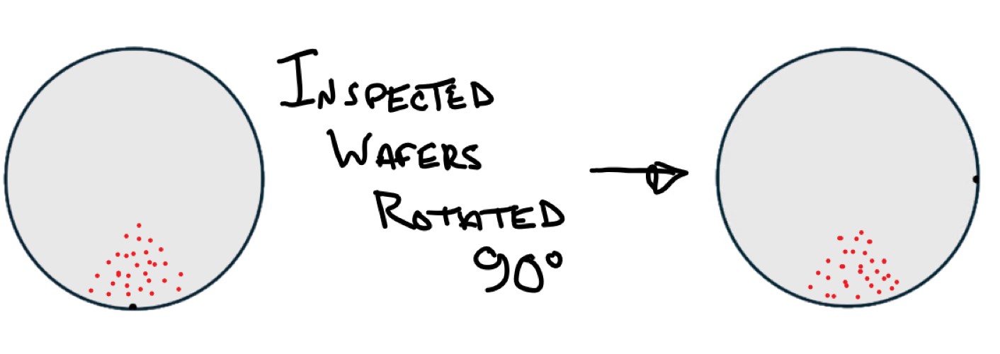
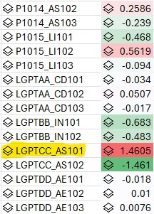
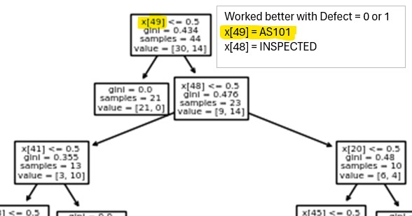
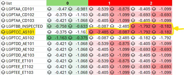
Data table is a list of process and equipment that wafers were processed or inspected with and if the wafer had a defect signature or not (0=clean, 1=defect at notch, 2=defect at 90d). Analysis results from a few classification models (logistic regression, naive bayes, decision tree) highlighting the suspect tool.
Logistic Regression
Only used binary 0 (clean) or 1 (defect signature) for the label. Results are for a small set of process/tools but it was repeated on a larger set with same results (50 process with 3 tools/process). Higher coefficient values highlight the suspect tool. However the interaction with the inspection tool is not brought out.
Decision Tree
Decision tree worked best with only 2 defect classes (0=clean, 1=defective) Results are for a small set of process/tools but it was repeated on a larger set with same results (50 process with 3 tools/process).
Naive Bayes
Naive Bayes works with multiple defect classes (0=clean, 1=defective at notch, 2=defect at 90d) Results are for a small set of process/tools but it was repeated on a larger set with same results (50 process with 3 tools/process). Suspect tools highlighted with log probability approaching 0. Naive Bayes was also able to highlight the Inspection interaction. When wafers were inspected they were returned rotated 90d so the resulting defects at the next process step were rotated 90d.
AI –> ML –> Deep Learning/Neural Nets
AI - intelligent machines
ML - Subset of AI algorithms which use data to learn and match patterns aka learn by example. Learn an approximate function that can be used to predict the response (dependent variable)
DL - Subset of ML for more complex tasks. Math heavy.
Inference vs prediction
- Prediction - Predict Y based on X (geared toward future prediction). Create the best model that can take in all the X features and predict Y with high accuracy (low error). What will my final CD be given this dose on this scanner with this etcher.
- linear regression, decision trees, support vector machines
- Inference is geared toward understanding the relationships and patterns between input and output variables. What impact do tools A, B and process C, D have on the yield.
- logistic regression, bayesian
Machine Learning
Python Machine Learning
Notes from udemy ML A-Z
Will be using scikit-learn which is easier to learn/use vs Tensorflow at the expense of being less powerful/flexible.
General Steps for Regression or Classification
- Data pre-processing
- Build
- Train (may be iterative process where you tweak/tune parameters)
- Make predictions
- Calculate performance metrics
- Make a verdict
Two types - Regression is when you predict a continuous real value. Classification is predicting a category. Regression models are listed first and then Classification.
Some libraries using scikit and scipy
import numpy as np
import matplotlib.pyplot as plt
import pandas as pd

# Pre-processing tools
from sklearn.impute import SimpleImputer        # Scrub data - populate empty cells with ave value of col

from sklearn.compose import ColumnTransformer   # Categorical data tool
from sklearn.preprocessing import OneHotEncoder # Take a category with unique vals and create multi bin values (1,0,0 and 0,1,0 etc)
from sklearn.preprocessing import LabelEncoder  # Encode No/Yes into 0,1

from sklearn.model_selection import train_test_split # Training and Test Sets

from sklearn.preprocessing import StandardScaler  # Scale the training set so data is in the same range

# Regression Models for Continues Real Numbers
from sklearn.linear_model import LinearRegression   # Single/Multiple linear regression
from sklearn.preprocessing import PolynomialFeatures # Used for Polynomial linear regression
from sklearn.svm import SVR                 # Support vector regression
from sklearn.tree import DecisionTreeRegressor # Decision tree regression
from sklearn.ensemble import RandomForestRegressor # Random forest

# Classification Models for Categories
from sklearn.linear_model import LogisticRegression # Logistic regression
from sklearn.neighbors import KNeighborsClassifier # K nearest neighbor
from sklearn.svm import SVC         # Support Vector Classification
from sklearn.naive_bayes import GaussianNB  # Naive Bayes
from sklearn.tree import DecisionTreeClassifier # Decision tree
from sklearn.ensemble import RandomForestClassifier # Random forest

# Unsupervised learning algorithms (identify patterns in unlabeled data)
# Clustering
from sklearn.cluster import KMeans   # K means clustering
import scipy.cluster.hierarchy as sch  # Hierarchy clustering
from sklearn.cluster import AgglomerativeClustering

# Association Rule Learning
from apyori import apriori   # apriori
Data Pre-Processing
Import
Features (independent variables) vs Dependent variable vector.
- Features/independent variables are the columns you use to predict the dependent variable (typically last column).
df = pd.read_csv('Data.csv')
X = df.iloc[:, :-1].values  # all rows/col except the last col (all feature/independent variables )
y = df.iloc[:, -1].values # dependent variable vector. last col
Scrub
What to do with bad/missing data
- Plot your data in a scatter plot or box plot to identify outliers. Drill down to the data point and see if you can determine obvious reasons for it being an outlier.
- Can simply leave it out if <1%
- Use imputer module to replace it with average data from that column
imputer = SimpleImputer(missing_values=np.nan, strategy='mean')
imputer.fit(X[:, 1:3])  # fit will look for missing values and calculate ave on X col 1,2
X[:, 1:3] = imputer.transform(X[:, 1:3]) # transform will perform the replacement
Encode Categorical Data
OneHotEncoder will take a category col (ie a col with 3 unique tool IDs) and create multiple columns to represent them as 1/0. So a col with 3 unique tool IDs would become 3 col with 1,0,0 and 0,1,0 and 0,0,1
ColumnTransformer takes 2 arg
- what kind of transformation and which index to perform it on
- remainder or which cols to keep that won’t have transformation applied
Example below using ‘encoder’ transformation with OneHotEncoder class on column 0 which is string type. ‘passthrough’ says to keep the columns that were not listed in the transform
# Remember toupdate the 3rd arg with the column to do OneHotEncoding on
ct = ColumnTransformer(transformers=[('encoder', OneHotEncoder(), [0])], remainder='passthrough')
X = np.array(ct.fit_transform(X))  # does fit and transform at same time. Must keep X as numpy array
Nominal scale variables are labeled with no specific order. Ordinal scale the variables are in a specific order (ie, low income, mid income, high income or less than 50, 50-100, over 100 or dislike, neutral, like etc)
Use label encoder to convert yes/no to 0/1
# For single vector, dependent variable, use label encoder to convert yes/no to 0/1 (binary)
le = LabelEncoder()
y = le.fit_transform(y)  # does not have to be numpy array
Training and Test Sets
Separating your data into two sets, training and test, allows you to compare the predicted values from the model to the actual values and generate accuracy scores, confusion matrix, etc. However if the data is limited and/or just searching for commonalities it is not necessary.
A starting point is to use 80% for training and the remaining data for testing.
Will create 4 sets.
- Pair of matrix features (Xtrain) and dependent variable (Ytrain) for train set.
- Pair of matrix features (Xtest) and dependent variable (Ytest) for test set.
X_train, X_test, y_train, y_test = train_test_split(X, y, test_size = 0.2, random_state = 1)
# 80% observations go to training and 20% to test
# random_state=1 for learning so will return same set as tutorial
# random_state=0 for non tutorial
Feature scaling
Scaling may be needed to normalize or standardize your data so one variable doesn’t over power another (one col ranges from 500-10500 and another ranges from 1-50). Typically not used for a lot of regression models because the coeffecients can compensate for high values of features. But useful on other models.
Feature scaling is applied after split. Your test split is supposed to represent new data that you don’t have until training is done so you don’t want to modify it.
Feature scaling always applied to columns (not row data across columns)
- Normalize values from 0-1 (Xnorm=(X-Xmin)/Xrange) # Works for normal distribution
- Standardize values from -3 to 3 except outliers (Xstand=(X-Xave)/Xstdev) # Works in most cases
Standardization is a good choice since it works in most cases. (do not apply to category col)
sc = StandardScaler()  # will calculate mean/std dev of columns for standardization
# fit will get the mean/sigma
# transform will modify data
# Note - only get fit on the training set
X_train[:, 3:] = sc.fit_transform(X_train[:, 3:]) # fit and transform. only apply to numerical col. Not the category in first 3 col
X_test[:, 3:] = sc.transform(X_test[:, 3:]) # do not create new fit. but apply the scalar transform calculated on training set
Modeling (Regression)
Linear vs non linear with respect to the class of regression/model refers to the coefficients (b₀, b₁), not the X feature. Can the model be expressed as a linear combination of coefficients. A non linear model would have b₀/(b₁+X₁) where you can not replace the coefficients with other coefficients to solve for X.
Details on concepts and 5 different methods
- All-in - Have prior knowledge or preparing for Backward Elimination
- Backward Elimination (* Stepwise Regression)
- Select a significance level to STAY in the model (0.05)
- Fit the full model with all possible predictors
- Consider the predictor with hightest P value. If P > SL go to next step, else finish (when all variables P < SL then model is finished).
- Remove the predictor
- Fit model with this variable. You have to rebuild/refit the model with the fewer number of variables. Will get new coefficients/constants. Keep looping steps 3-5. Remove predictor with highest P val. Fit the model again with one less variable. Keep repeating until variable with highest P is less than the SL.
- Forward Selection. Growing one variable at a time (* Stepwise Regression)
- Select a SL to ENTER the model (SL= 0.05)
- Fit all simple regression models. Fit y to all the separate X features. Select the one with the lowest P value
- Keep this variable and fit all possible models with one extra predictor added to the one(s) you already have
- Consider the predictor with the lowest P-value. If P < SL, go to step 3, else finish and keep the previous model before adding the last var.
- Bidirectional Elimination - Combine methods 2-3 (** Stepwise Regression)
- Select a SL to ENTER and to STAY in the model (.05)
- Perform the next step of Forward Selection (new var must have : P < SLENTER to enter)
- Perform ALL steps of Backward Elimination (old variables must have P < SLSTAY to stay)
- No new variables can enter and no old variables can exit
- Score Comparison - All Possible Models
- Select a criterion of goodness of fit
- Construct all possible regression models
- Select the one with the best criterion
LinearRegression class will iterate thru multiple features to find highest P value
Linear Regression ý=b₀+b₁X₁
- ý is dependent var (hat refers to a predictor)
- X₁ is independent var (feature)
- b₀ is y-intercept (constant)
- b₁ is slope coefficient
- 1 X or feature
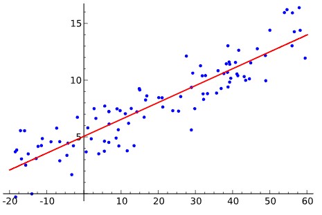
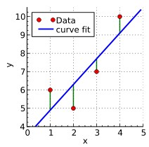
Line is derived using ordinary least squares. Minimize error. Sum of squares.
- residual Ɛᵢ=yᵢ-ýᵢ
- sum(yᵢ-ýᵢ)² is minimized
Assumptions
- Linear relationship between Y and each X
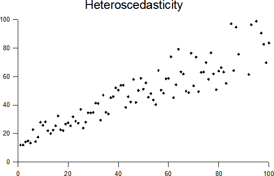
- Equal variance (Homoscedasticity) - Can not show cone shape in variation or showing variation is dependent on X
- Normality of error distribution (Multivariate Normality) - If you look along the line of linear regression would want to see normal distribution.
- Independence (no autocorrelation) - No patterns in the data. ie stock market where previous prices affect future
- Lack of Multicollinearity - Predictors are not correlated to each other. See category example below.
- Outlier check
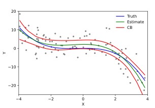
Examples of linear regression, deviation to model fit, cubic polynomial fit, and unequal variation (relationship between the Y dependent variation and the X feature).
By Krishnavedala - Own work, CC BY-SA 3.0, By Skbkekas - Own work, CC BY 3.0, Heteroscedasticity By Q9 at the English-language Wikipedia, CC BY-SA 3.0,
from sklearn.linear_model import LinearRegression   # Single/Multiple linear regression
# Using LineaerRegression. Will avoid dummy variable issue
regressor = LinearRegression() # Build linear regression model and create object
regressor.fit(X_train, y_train) # Train on the training set using fit method

# Predict method expect 2D array
y_pred = regressor.predict(X_test) # Predict test results using predict method.

# Plot training set
plt.scatter(X_train, y_train, color = 'red')
plt.plot(X_train, regressor.predict(X_train), color = 'blue') # use plot to graph function, the regression line
plt.title('Salary vs Experience (Training set)')
plt.xlabel('Years of Experience')
plt.ylabel('Salary')
plt.show()

# Plot test set
plt.scatter(X_test, y_test, color = 'red')
plt.plot(X_train, regressor.predict(X_train), color = 'blue') # regression line between test and train will be the same. Could plot either
plt.title('Salary vs Experience (Test set)')
plt.xlabel('Years of Experience')
plt.ylabel('Salary')
plt.show()

# Get value
# Predict method expect 2D array
print(regressor.predict([[12]])) # prediction for 12yr experience. 2D array

# Print equation coefficients
print(regressor.coef_)
print(regressor.intercept_)

# salary = 26816 + 9345(year experience)
Multiple Linear Regression
ý=b₀+b₁X₁+b₂X₂+..bₙXₙ + b₄D₁
- More than 1 X feature.
- Do not need to apply feature scaling
- Do not need to test for linear regression assumptions. It will just show a lower score and you will need to pick a different model.
- ý is dependent var
- X₁ is independent var (feature matrix) for each col or X
- b₀ is y-intercept (constant)
- b₁ is slope coefficient
- D₁ is category - need to find how many unique values are in the col and split into multiple Dummy binary Variable columns (0,1). This LinearRegression class will omit one of the dummy variable col. If you have 4 then include 3. If 2 then include 1. Why? If 2 unique values only include 1 dummy col, not both. D2=1-D1 so you have a case of independent variable predicting another is Multicollinearity.
There are multiple columns/features and we can not visualize the multidimensional output so use vectors to compare. Compare vector of the predicted vs vector of the test set result.
# Using LineaerRegression.
from sklearn.linear_model import LinearRegression   # Single/Multiple linear regression
# Will also iterate thru multiple features to find highest P value
regressor = LinearRegression() # Build linear regression model and create object
regressor.fit(X_train, y_train) # Train on the training set using fit method

y_pred = regressor.predict(X_test) # Predict test results using predict method.

np.set_printoptions(precision=2)
# numpy concactanate allows to concatenate vectors or arrays either horizontally or vertically. axis=0,1 for vert/horiz
# Will use it to concatanate vertically the predicted and real profits.
# Pass vector of predicted result and real result (y_pred and y_test)
# Use reshape to go from horiz to vert and 1 is for 1 col.
print(np.concatenate((y_pred.reshape(len(y_pred),1), y_test.reshape(len(y_test),1)),1))

# Single prediction
# Predict method expect 2D array
print(regressor.predict([[1, 0, 0, 160000, 130000, 300000]]))
"""
double pair of square brackets.  "predict" method expects 2D array as the format

1,0,0,160000,130000,300000→scalars
[1,0,0,160000,130000,300000]→1D array
[[1,0,0,160000,130000,300000]]→2D array
"""

# Get coefficients
print(regressor.coef_)
print(regressor.intercept_)

"""Profit=86.6×Dummy State 1−873×Dummy State 2+786×Dummy State 3+0.773×R&D Spend+0.0329×Administration+0.0366×Marketing Spend+42467.53
"""
Polynomial Linear Regression
ý=b₀+b₁X₁+b₂X₁²+..bₙX₁ⁿ
- Now the X feature may be at a higher power. ie X₁² If degree of 2 then quadratic model, if degree of 3 then cubic model ..
- Polynomial linear regression is just a type of multiple linear regression. It is still a linear model
- X portion is not linear .. but Linear regression applies to the coefficients (b1) part. Trying determine the coefficients so can plug in varying X values and determine the output.
- The linear/non-linear refers to the coefficients (b) and if the function can be expressed as a linear combination of coefficients.
- Do not need to apply feature scaling
- Do not need to test for linear regression assumptions. It will just show a lower score and you will need to pick a different model.
- ý is dependent var
- X₁ is independent var (feature matrix) for each col or X
- b₀ is y-intercept (constant)
- b₁ is slope coefficient
from sklearn.linear_model import LinearRegression   # Single/Multiple linear regression
from sklearn.preprocessing import PolynomialFeatures
# Training the Linear Regression model on the whole dataset
lin_reg = LinearRegression()
# X,y is not broken into train/test set because all data is being used to create the model.
# The goal is to determine salary between level 6 and 7 so want all the data for the model.
lin_reg.fit(X, y)

# Training the Polynomial Regression model on the whole dataset
# X=position levels and Y=salaries
poly_reg = PolynomialFeatures(degree = 4) # enter the order. start with 2nd, 3rd, 4th
X_poly = poly_reg.fit_transform(X)
lin_reg_2 = LinearRegression()
lin_reg_2.fit(X_poly, y)

# Visualize the linear and polynomial results
plt.scatter(X, y, color = 'red')
plt.plot(X, lin_reg.predict(X), color = 'blue')
plt.title('Truth or Bluff (Linear Regression)')
plt.xlabel('Position Level')
plt.ylabel('Salary')
plt.show()

plt.scatter(X, y, color = 'red')
plt.plot(X, lin_reg_2.predict(X_poly), color = 'blue')
plt.title('Truth or Bluff (Polynomial Regression)')
plt.xlabel('Position level')
plt.ylabel('Salary')
plt.show()

# Higher resolution and smoother curve
X_grid = np.arange(min(X), max(X), 0.1)
X_grid = X_grid.reshape((len(X_grid), 1))
plt.scatter(X, y, color = 'red')
plt.plot(X_grid, lin_reg_2.predict(poly_reg.fit_transform(X_grid)), color = 'blue')
plt.title('Truth or Bluff (Polynomial Regression)')
plt.xlabel('Position level')
plt.ylabel('Salary')
plt.show()

# Predict new results with linear regression
# Predict method expect 2D array
lin_reg.predict([[6.5]])

# Predict new results with polynomial regression
# Can not just enter X, but have to enter X, X^2, X^3, X^4
# This is in the X_poly or poly_reg.fit_transform(X)
lin_reg_2.predict(poly_reg.fit_transform([[6.5]]))
Support Vector Regression
Apply a buffer margin or tube where the error does not matter. But points outside the tube are support vectors and dictate the tube.
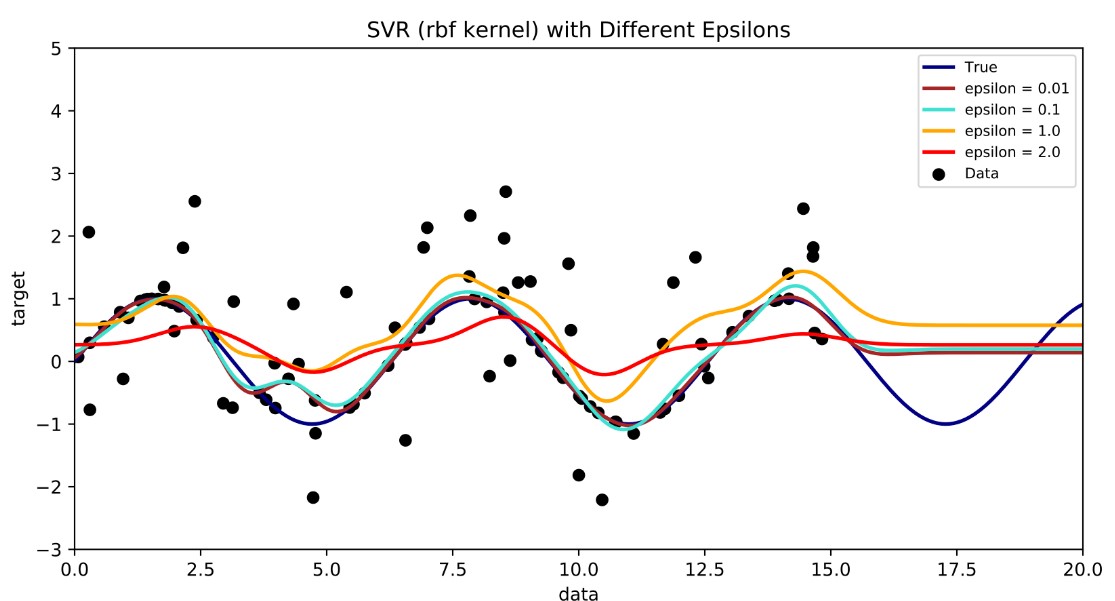
By Shiyu Ji - Own work, CC BY-SA 4.0,
Example will have feature scaling. Job class feature was from 1-15 and dependent Y salary was 45k-1M so had to scale the variables.
from sklearn.svm import SVR

y = y.reshape(len(y),1) # used to get array into 2D array with 1 col for standard scalar function

# StandardScaler will calculate mean/std dev of columns for standardization
sc_X = StandardScaler()
sc_y = StandardScaler()
X = sc_X.fit_transform(X)  # scale the X col feature and Y dependent var separately
y = sc_y.fit_transform(y)

regressor = SVR(kernel = 'rbf')  # Gaussian radial basis function kernel
regressor.fit(X, y)

# Need to reverse the scaling to get original scale
# predict method expect 2D array
sc_y.inverse_transform(regressor.predict(sc_X.transform([[6.5]])).reshape(-1,1))

plt.scatter(sc_X.inverse_transform(X), sc_y.inverse_transform(y), color = 'red')
plt.plot(sc_X.inverse_transform(X), sc_y.inverse_transform(regressor.predict(X).reshape(-1,1)), color = 'blue')
plt.title('Truth or Bluff (SVR)')
plt.xlabel('Position level')
plt.ylabel('Salary')
plt.show()

# Higher resolution
X_grid = np.arange(min(sc_X.inverse_transform(X)), max(sc_X.inverse_transform(X)), 0.1)
X_grid = X_grid.reshape((len(X_grid), 1))
plt.scatter(sc_X.inverse_transform(X), sc_y.inverse_transform(y), color = 'red')
plt.plot(X_grid, sc_y.inverse_transform(regressor.predict(sc_X.transform(X_grid)).reshape(-1,1)), color = 'blue')
plt.title('Truth or Bluff (SVR)')
plt.xlabel('Position level')
plt.ylabel('Salary')
plt.show()
Decision Tree/Random Forest Regression
CART (Classification and Regression Tree)
Scaling is not required since predictions from decision tree regression are resulting from successive splits of the data through nodes of the tree and not equations like other models.
Decision tree is not ideal for single feature data set. Best for many data cols.
from sklearn.tree import DecisionTreeRegressor

regressor = DecisionTreeRegressor(random_state = 0)
regressor.fit(X, y)

regressor.predict([[6.5]])

# High resolution
X_grid = np.arange(min(X), max(X), 0.01)
X_grid = X_grid.reshape((len(X_grid), 1))
plt.scatter(X, y, color = 'red')
plt.plot(X_grid, regressor.predict(X_grid), color = 'blue')
plt.title('Truth or Bluff (Decision Tree Regression)')
plt.xlabel('Position level')
plt.ylabel('Salary')
plt.show()
Random Forest
Ensemble. Build a lot of decision trees. Instead of just getting one prediction you get a lot of predictions (500+). Average across the predictions.
- Pick at random K data points from training set
- Build the decision tree associated to these K data points
- Choose the number Ntree of trees you want to build and repeat steps 1-2
- For a new data point, make each one of Ntree trees predic the valueo of Y for the data point in question and assign the new data point the average across all of the predicted Y values.
from sklearn.ensemble import RandomForestRegressor
from sklearn.ensemble import RandomForestRegressor
regressor = RandomForestRegressor(n_estimators = 10, random_state = 0)
regressor.fit(X, y)

regressor.predict([[6.5]])

X_grid = np.arange(min(X), max(X), 0.01)
X_grid = X_grid.reshape((len(X_grid), 1))
plt.scatter(X, y, color = 'red')
plt.plot(X_grid, regressor.predict(X_grid), color = 'blue')
plt.title('Truth or Bluff (Random Forest Regression)')
plt.xlabel('Position level')
plt.ylabel('Salary')
plt.show()
Evaluation (Regression R²)
R² can be used to compare models for model selection.
The better the linear fit matches the data in comparison to a simple average your R² value will approach 1 (Sum of Squares for linear regression fit will be close to 0, 1-0=1)
- residual Ɛᵢ=yᵢ-ýᵢ
- sum(yᵢ-ýᵢ)² is minimized
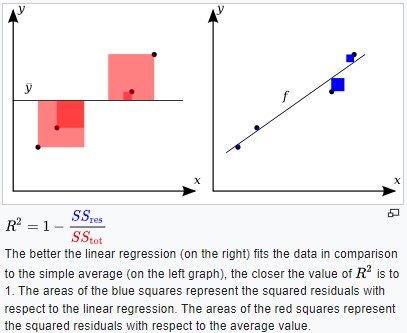
By Orzetto - Own work, CC BY-SA 3.0,
- R² > 0.9 is good
- R² < 0.7 its marginal
- R² ~ 0.4 is bad
ý=b₀+b₁X₁+b₂X₂+..bₙXₙ
As you add more features/col (X’s) the SStot does not change but the SSres may decrease or stay the same. This is a problem because as you add more columns of data/features your R² may appear to improve even though they may not be relevant or adding value.
Could use adjusted R².

n - sample size p - number of independent variables. as more variables add the R² will actually decrease unless the new variable improves the fit.
R²adj = 1-(1-R²)*(n-1)/(n-p-1) p - number of independent variables
n - sample size
As more variables added the R² will actually decrease unless the new variable improves the fit.
from sklearn.metrics import r2_score
r2_score(y_test, y_pred)

# NEED TO CHECK Radj formula below
1 - ( 1-r2_score(y_test, y_pred) ) * ( len(y_pred) - 1 ) / ( len(y_pred) - X_test.shape[1] - 1 )
len(X_test.columns) or X_test.shape[1] for number of values?
Run your data through all models and compare R²
Modeling (Classification)
Classification is a ML method to identify the category of new observations based on training data.
- Logistic Regression predicts binary outcome (pass/fail)
- K-NN is pattern recognition algorithm that uses training datasets to find the k closest relatives in future examples.
- SVM kernel is multidimensional. Assigns a hyperplane that best separates the features.
- Naive Bayes calculates the possibility of whether a data point belongs within a certain category.
- Random Forest/Decision Tree - supervised learning algorithm that works like a flow chart. Separates data points into two similar categories at a time from the trunk to branches to leaves. Random forest averages the decision trees.
Logistic Regression
Logistic Regression will give a probability. Can split into two categories >50% or < 50% and get a binary 0,1 output.
Logistic regression classifier is a linear classifier so the prediction boundary/line will be straight line.
The features are weighted. And the weights are interpretable
Prefer the dependent/data labels are balanced. ie have equal number of 0’s and 1’s.

By Canley - Own work, CC BY-SA 4.0,

from sklearn.preprocessing import StandardScaler

# scaling
sc = StandardScaler()
X_train = sc.fit_transform(X_train)
X_test = sc.transform(X_test) # do not create new fit. but apply the scalar transform calculated on training set

from sklearn.linear_model import LogisticRegression
classifier = LogisticRegression(random_state = 1)
classifier.fit(X_train, y_train)

results = classifier.coef_ # To see the coefficients. Higher coeff: 1 Lower coeff: 0

# Predicting
print(classifier.predict(sc.transform([[30,87000]]))) # Have to use transform since model had scaled values used for training

# print out a matrix of the prediction (Y predicted) vs the actual (Y test)
y_pred = classifier.predict(X_test)
print(np.concatenate((y_pred.reshape(len(y_pred),1), y_test.reshape(len(y_test),1)),1))

# Confusion Matrix
from sklearn.metrics import confusion_matrix, accuracy_score
cm = confusion_matrix(y_test, y_pred)
print(cm)
"""
[[65  3]  # There are 65 correct predictions of 0 (3 incorrect)
 [ 8 24]] # There are 24 correct predictions of 1 (8 incorrect)
          # Total of 89 correct predictions
"""
accuracy_score(y_test, y_pred) # accuracy score was 0.89 or 89% correct. There were
# 100 samples in the test set. 65 + 24 = 89 (89% of 100)

# Visualize training set
from matplotlib.colors import ListedColormap
X_set, y_set = sc.inverse_transform(X_train), y_train
X1, X2 = np.meshgrid(np.arange(start = X_set[:, 0].min() - 10, stop = X_set[:, 0].max() + 10, step = 0.25),
                     np.arange(start = X_set[:, 1].min() - 1000, stop = X_set[:, 1].max() + 1000, step = 0.25))
plt.contourf(X1, X2, classifier.predict(sc.transform(np.array([X1.ravel(), X2.ravel()]).T)).reshape(X1.shape),
             alpha = 0.75, cmap = ListedColormap(('red', 'green')))
plt.xlim(X1.min(), X1.max())
plt.ylim(X2.min(), X2.max())
for i, j in enumerate(np.unique(y_set)):
    plt.scatter(X_set[y_set == j, 0], X_set[y_set == j, 1], c = ListedColormap(('red', 'green'))(i), label = j)
plt.title('Logistic Regression (Training set)')
plt.xlabel('Age')
plt.ylabel('Estimated Salary')
plt.legend()
plt.show()

# Visualize Test set
from matplotlib.colors import ListedColormap
X_set, y_set = sc.inverse_transform(X_test), y_test
X1, X2 = np.meshgrid(np.arange(start = X_set[:, 0].min() - 10, stop = X_set[:, 0].max() + 10, step = 0.25),
                     np.arange(start = X_set[:, 1].min() - 1000, stop = X_set[:, 1].max() + 1000, step = 0.25))
plt.contourf(X1, X2, classifier.predict(sc.transform(np.array([X1.ravel(), X2.ravel()]).T)).reshape(X1.shape),
             alpha = 0.75, cmap = ListedColormap(('red', 'green')))
plt.xlim(X1.min(), X1.max())
plt.ylim(X2.min(), X2.max())
for i, j in enumerate(np.unique(y_set)):
    plt.scatter(X_set[y_set == j, 0], X_set[y_set == j, 1], c = ListedColormap(('red', 'green'))(i), label = j)
plt.title('Logistic Regression (Test set)')
plt.xlabel('Age')
plt.ylabel('Estimated Salary')
plt.legend()
plt.show()
K-Nearest Neighbors (K-NN)
Note - the color map visualizations only works for datasets with 2 features
KNN is a nonlinear classifier
- Chose the number of K neighbors (5 is a good starting point)
- Take the K nearest neighbors of the new data point, according to the Euclidean distance sqrt(x^2+y^2)
- Among these K neighbors, count the number of data points in each category
- Assign the new data point to the category where you counted the most neighbors
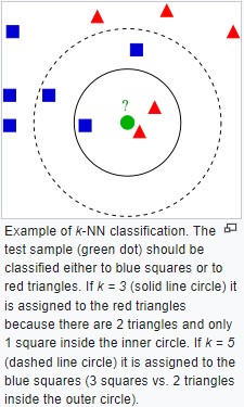
By Antti Ajanki AnAj - Own work, CC BY-SA 3.0,
KNeighborsClassifier args
- 5 is good starting point for K number of neighbors
- metric is the distance you want to use between observation point and neighbors. To use euclidean dist choose minkowski metric with p=2
from sklearn.neighbors import KNeighborsClassifier
classifier = KNeighborsClassifier(n_neighbors = 5, metric = 'minkowski', p = 2)
classifier.fit(X_train, y_train) # train it on the training set

print(classifier.predict(sc.transform([[30,87000]])))

y_pred = classifier.predict(X_test)
print(np.concatenate((y_pred.reshape(len(y_pred),1), y_test.reshape(len(y_test),1)),1))

from sklearn.metrics import confusion_matrix, accuracy_score
cm = confusion_matrix(y_test, y_pred)
print(cm)
accuracy_score(y_test, y_pred)

from matplotlib.colors import ListedColormap
X_set, y_set = sc.inverse_transform(X_train), y_train
X1, X2 = np.meshgrid(np.arange(start = X_set[:, 0].min() - 10, stop = X_set[:, 0].max() + 10, step = 1),
                     np.arange(start = X_set[:, 1].min() - 1000, stop = X_set[:, 1].max() + 1000, step = 1))
plt.contourf(X1, X2, classifier.predict(sc.transform(np.array([X1.ravel(), X2.ravel()]).T)).reshape(X1.shape),
             alpha = 0.75, cmap = ListedColormap(('red', 'green')))
plt.xlim(X1.min(), X1.max())
plt.ylim(X2.min(), X2.max())
for i, j in enumerate(np.unique(y_set)):
    plt.scatter(X_set[y_set == j, 0], X_set[y_set == j, 1], c = ListedColormap(('red', 'green'))(i), label = j)
plt.title('K-NN (Training set)')
plt.xlabel('Age')
plt.ylabel('Estimated Salary')
plt.legend()
plt.show()

from matplotlib.colors import ListedColormap
X_set, y_set = sc.inverse_transform(X_test), y_test
X1, X2 = np.meshgrid(np.arange(start = X_set[:, 0].min() - 10, stop = X_set[:, 0].max() + 10, step = 1),
                     np.arange(start = X_set[:, 1].min() - 1000, stop = X_set[:, 1].max() + 1000, step = 1))
plt.contourf(X1, X2, classifier.predict(sc.transform(np.array([X1.ravel(), X2.ravel()]).T)).reshape(X1.shape),
             alpha = 0.75, cmap = ListedColormap(('red', 'green')))
plt.xlim(X1.min(), X1.max())
plt.ylim(X2.min(), X2.max())
for i, j in enumerate(np.unique(y_set)):
    plt.scatter(X_set[y_set == j, 0], X_set[y_set == j, 1], c = ListedColormap(('red', 'green'))(i), label = j)
plt.title('K-NN (Test set)')
plt.xlabel('Age')
plt.ylabel('Estimated Salary')
plt.legend()
plt.show()
Support Vector Machine (SVM) Kernel
Defines a support vector to separate groups or classes. Differs from traditional ML in that it focuses on observation points that are close to the boundary separating the classes vs focusing on observations that are safe, classic example of each class. SVMs select a decision boundary which maximizes the distance from the closest data points of all classes. The decision boundary provided by the SVMs can be referred to as the maximum margin hyperplane or the maximum margin classifier and it will search through this margin.
- SVR can use both linear and non-linear kernels. The kernel you choose will depend on the data complexity.
- SVR is different from standard linear regression because it finds a hyperplane that best fits the data points in a continuous space.
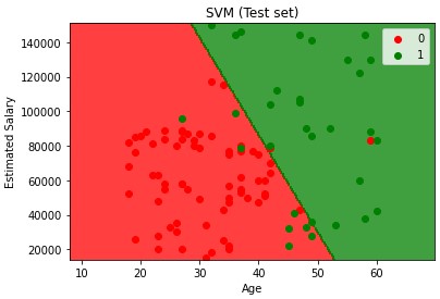
Example below uses linear kernel assuming data is linearly separable
# Train SMV model on the training set
from sklearn.svm import SVC
classifier = SVC(kernel = 'linear', random_state = 1) # using a linear kernel
classifier.fit(X_train, y_train)

# Predict a new result
print(classifier.predict(sc.transform([[30,87000]])))

# Predicting the test set results
y_pred = classifier.predict(X_test)
print(np.concatenate((y_pred.reshape(len(y_pred),1), y_test.reshape(len(y_test),1)),1))

# Making the confusion matrix
from sklearn.metrics import confusion_matrix, accuracy_score
cm = confusion_matrix(y_test, y_pred)
print(cm)
accuracy_score(y_test, y_pred)

# Visualize training set
from matplotlib.colors import ListedColormap
X_set, y_set = sc.inverse_transform(X_train), y_train
X1, X2 = np.meshgrid(np.arange(start = X_set[:, 0].min() - 10, stop = X_set[:, 0].max() + 10, step = 0.25),
                     np.arange(start = X_set[:, 1].min() - 1000, stop = X_set[:, 1].max() + 1000, step = 0.25))
plt.contourf(X1, X2, classifier.predict(sc.transform(np.array([X1.ravel(), X2.ravel()]).T)).reshape(X1.shape),
             alpha = 0.75, cmap = ListedColormap(('red', 'green')))
plt.xlim(X1.min(), X1.max())
plt.ylim(X2.min(), X2.max())
for i, j in enumerate(np.unique(y_set)):
    plt.scatter(X_set[y_set == j, 0], X_set[y_set == j, 1], c = ListedColormap(('red', 'green'))(i), label = j)
plt.title('SVM (Training set)')
plt.xlabel('Age')
plt.ylabel('Estimated Salary')
plt.legend()
plt.show()

# Visualize test set
from matplotlib.colors import ListedColormap
X_set, y_set = sc.inverse_transform(X_test), y_test
X1, X2 = np.meshgrid(np.arange(start = X_set[:, 0].min() - 10, stop = X_set[:, 0].max() + 10, step = 0.25),
                     np.arange(start = X_set[:, 1].min() - 1000, stop = X_set[:, 1].max() + 1000, step = 0.25))
plt.contourf(X1, X2, classifier.predict(sc.transform(np.array([X1.ravel(), X2.ravel()]).T)).reshape(X1.shape),
             alpha = 0.75, cmap = ListedColormap(('red', 'green')))
plt.xlim(X1.min(), X1.max())
plt.ylim(X2.min(), X2.max())
for i, j in enumerate(np.unique(y_set)):
    plt.scatter(X_set[y_set == j, 0], X_set[y_set == j, 1], c = ListedColormap(('red', 'green'))(i), label = j)
plt.title('SVM (Test set)')
plt.xlabel('Age')
plt.ylabel('Estimated Salary')
plt.legend()
plt.show()
Kernel SVM
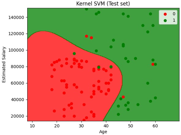
Kernel trick - Why? Because taking a non linearly separable data set and mapping it to a higher dimension to get a linearly separable data set. Then invoking the SVM alogrithm, building a decision boundary for the data and projecting all of that back into the original dimensions is computer intensive.
Non linear SVM
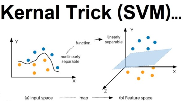
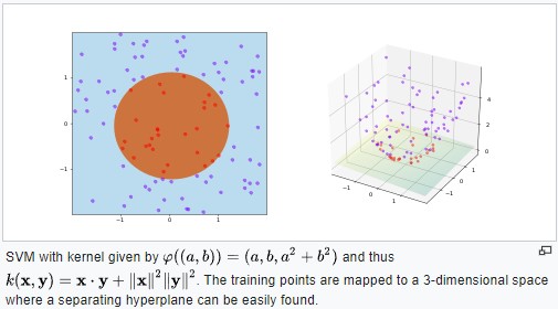
By Shiyu Ji - Own work, CC BY-SA 4.0,
Types of Kernel Functions
- Gaussian aka radial basis of function kernel

- Sigmoid
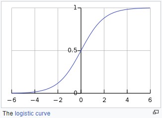
By Qef (talk) - Created from scratch with gnuplot, Public Domain,
Linear model/separator
- in a 1 dimensional space it is a dot
- in a 2 dimensional space it is a line
- in a 3 dimensional space it is a hyperplane
from sklearn.svm import SVC
classifier = SVC(kernel = 'rbf', random_state = 0) # radial basis of function is nonlinear
classifier.fit(X_train, y_train) # Train the kernel svm model on the training set

# Predict a new result
print(classifier.predict(sc.transform([[30,87000]])))

# Predicting the test set results
y_pred = classifier.predict(X_test)
print(np.concatenate((y_pred.reshape(len(y_pred),1), y_test.reshape(len(y_test),1)),1))

# Build confusion matrix
from sklearn.metrics import confusion_matrix, accuracy_score
cm = confusion_matrix(y_test, y_pred)
print(cm)
accuracy_score(y_test, y_pred)

# Visualize the training set results
from matplotlib.colors import ListedColormap
X_set, y_set = sc.inverse_transform(X_train), y_train
X1, X2 = np.meshgrid(np.arange(start = X_set[:, 0].min() - 10, stop = X_set[:, 0].max() + 10, step = 0.25),
                     np.arange(start = X_set[:, 1].min() - 1000, stop = X_set[:, 1].max() + 1000, step = 0.25))
plt.contourf(X1, X2, classifier.predict(sc.transform(np.array([X1.ravel(), X2.ravel()]).T)).reshape(X1.shape),
             alpha = 0.75, cmap = ListedColormap(('red', 'green')))
plt.xlim(X1.min(), X1.max())
plt.ylim(X2.min(), X2.max())
for i, j in enumerate(np.unique(y_set)):
    plt.scatter(X_set[y_set == j, 0], X_set[y_set == j, 1], c = ListedColormap(('red', 'green'))(i), label = j)
plt.title('Kernel SVM (Training set)')
plt.xlabel('Age')
plt.ylabel('Estimated Salary')
plt.legend()
plt.show()

# visualize the test set results
from matplotlib.colors import ListedColormap
X_set, y_set = sc.inverse_transform(X_test), y_test
X1, X2 = np.meshgrid(np.arange(start = X_set[:, 0].min() - 10, stop = X_set[:, 0].max() + 10, step = 0.25),
                     np.arange(start = X_set[:, 1].min() - 1000, stop = X_set[:, 1].max() + 1000, step = 0.25))
plt.contourf(X1, X2, classifier.predict(sc.transform(np.array([X1.ravel(), X2.ravel()]).T)).reshape(X1.shape),
             alpha = 0.75, cmap = ListedColormap(('red', 'green')))
plt.xlim(X1.min(), X1.max())
plt.ylim(X2.min(), X2.max())
for i, j in enumerate(np.unique(y_set)):
    plt.scatter(X_set[y_set == j, 0], X_set[y_set == j, 1], c = ListedColormap(('red', 'green'))(i), label = j)
plt.title('Kernel SVM (Test set)')
plt.xlabel('Age')
plt.ylabel('Estimated Salary')
plt.legend()
plt.show()
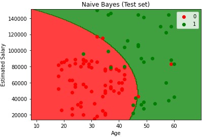
Examples .. Logistic Regression, KNN, SVM_linear, SVM_kernel, Bayes
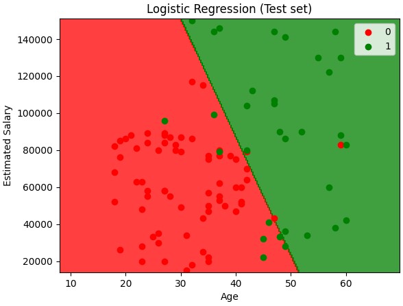
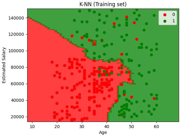
Naive Bayes
Called Naive because you assume X and Y are not dependent when they may be. But it still works.
Bayes is a probabilistic type of classify because you first calculate the probabilities and then based on those probabilities assign the new point a class. The dependent/y does not need to be binary. Can have multiple classes.
Gaussian NB would not work on binary features. For categorical features use the CategoricalNB model
Bayes Theorem Example
tool1: 60pph P(tool1)=60/100=0.6
tool2: 40pph P(tool2)=40/100=0.4
out of all parts 1% are defective P(defect)=1%
out of all defective parts 50% from tool1 and 50% from tool2
P(tool1|defect) = 50%
P(tool2|defect) = 50%
| ( | means given) |
What is propability that a part produced by tool2 is defective?
P(defect|tool2)=P(tool2|defect)P(defect)/P(tool2)
P(defect|tool2)=0.50.01/0.4 = 0.0125 (12,500ppm are defective)
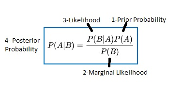
example
1 group walks
1 group drives
X Y chart
P(walks|X)=P(X|walks)*P(walks)/P(X)
- Prior Probability= P(walks)
- Marignal Likelihood = P(X)
-
Likelihood = P(X walks) -
Posterior Probability=P(walks X)
| Compare P(walks | X) vs P(drives | X) |
Going to add a new observation to data set Calculate P(walks|X) first
- P(walks)=Total Walkers/Total Observations=10/30
- P(X)=What is the likelihood of any new random pt added to data set falling within the circle. The user selects the radius of the circle around the new data pt. Any points in the circle will be deemed similar to the observation being added. P(X)=Number of Similar Observations/Total Observations=4/30
-
P(X walks)=Same circle but now only working with data pts of the ‘walks’ class. = Number of Similar Observations Among those who walk/total number of walkers = 3/10 -
P(walks X)=3/10 * 10/30 / 4/30 = 0.75
Calculate P(drives|X) second
P(drives|X)=1/20 * 20/30 / 4/30 = 0.25
.75 vs .25 or 75% change the person walks vs 25% change the person drives so will classify as a walker.
| For Compare P(walks | X) vs P(drives | X) the denominator of P(X) is in both equations so if only comparing can cancel it out and reduce to |
| P(X | walks)*P(walks) vs P(X | drives) * P(drives) |
from sklearn.naive_bayes import GaussianNB
classifier = GaussianNB()
# classifier = CategoricalNB() # if features are categorical

classifier.fit(X_train, y_train)

results = classifier.feature_log_prob_ # NumPy array of the log-probabilities of # each feature for each class. The array is of shape (n_features, n_classes)
# Each array provides the empirical log probability of categories given the # respective feature and class, P(x_i|y).

print(classifier.predict(sc.transform([[30,87000]])))

y_pred = classifier.predict(X_test)
print(np.concatenate((y_pred.reshape(len(y_pred),1), y_test.reshape(len(y_test),1)),1))

from matplotlib.colors import ListedColormap
X_set, y_set = sc.inverse_transform(X_train), y_train
X1, X2 = np.meshgrid(np.arange(start = X_set[:, 0].min() - 10, stop = X_set[:, 0].max() + 10, step = 0.25),
                     np.arange(start = X_set[:, 1].min() - 1000, stop = X_set[:, 1].max() + 1000, step = 0.25))
plt.contourf(X1, X2, classifier.predict(sc.transform(np.array([X1.ravel(), X2.ravel()]).T)).reshape(X1.shape),
             alpha = 0.75, cmap = ListedColormap(('red', 'green')))
plt.xlim(X1.min(), X1.max())
plt.ylim(X2.min(), X2.max())
for i, j in enumerate(np.unique(y_set)):
    plt.scatter(X_set[y_set == j, 0], X_set[y_set == j, 1], c = ListedColormap(('red', 'green'))(i), label = j)
plt.title('Naive Bayes (Training set)')
plt.xlabel('Age')
plt.ylabel('Estimated Salary')
plt.legend()
plt.show()

from matplotlib.colors import ListedColormap
X_set, y_set = sc.inverse_transform(X_test), y_test
X1, X2 = np.meshgrid(np.arange(start = X_set[:, 0].min() - 10, stop = X_set[:, 0].max() + 10, step = 0.25),
                     np.arange(start = X_set[:, 1].min() - 1000, stop = X_set[:, 1].max() + 1000, step = 0.25))
plt.contourf(X1, X2, classifier.predict(sc.transform(np.array([X1.ravel(), X2.ravel()]).T)).reshape(X1.shape),
             alpha = 0.75, cmap = ListedColormap(('red', 'green')))
plt.xlim(X1.min(), X1.max())
plt.ylim(X2.min(), X2.max())
for i, j in enumerate(np.unique(y_set)):
    plt.scatter(X_set[y_set == j, 0], X_set[y_set == j, 1], c = ListedColormap(('red', 'green'))(i), label = j)
plt.title('Naive Bayes (Test set)')
plt.xlabel('Age')
plt.ylabel('Estimated Salary')
plt.legend()
plt.show()
When you have more than 2 classes It follows a similar/straight process as it always adds up to 1. If you have 3 classes and classify 1 and it’s greater than 50% you can assign that class, but if not you have to calculate for each to assign the classification.
Decision Tree/Random Forest Classification
CART - Classification (categories) vs regression (real numbers)
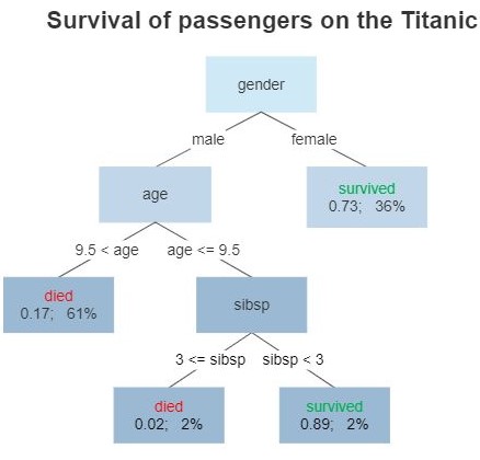
By Gilgoldm - Own work, CC BY-SA 4.0,
from sklearn.tree import DecisionTreeClassifier
classifier = DecisionTreeClassifier(criterion = 'entropy', random_state = 0) # entropy or gini
classifier.fit(X_train, y_train)

print(classifier.predict(sc.transform([[30,87000]])))

y_pred = classifier.predict(X_test)
print(np.concatenate((y_pred.reshape(len(y_pred),1), y_test.reshape(len(y_test),1)),1))

from sklearn.metrics import confusion_matrix, accuracy_score
cm = confusion_matrix(y_test, y_pred)
print(cm)
accuracy_score(y_test, y_pred)

from matplotlib.colors import ListedColormap
X_set, y_set = sc.inverse_transform(X_train), y_train
X1, X2 = np.meshgrid(np.arange(start = X_set[:, 0].min() - 10, stop = X_set[:, 0].max() + 10, step = 0.25),
                     np.arange(start = X_set[:, 1].min() - 1000, stop = X_set[:, 1].max() + 1000, step = 0.25))
plt.contourf(X1, X2, classifier.predict(sc.transform(np.array([X1.ravel(), X2.ravel()]).T)).reshape(X1.shape),
             alpha = 0.75, cmap = ListedColormap(('red', 'green')))
plt.xlim(X1.min(), X1.max())
plt.ylim(X2.min(), X2.max())
for i, j in enumerate(np.unique(y_set)):
    plt.scatter(X_set[y_set == j, 0], X_set[y_set == j, 1], c = ListedColormap(('red', 'green'))(i), label = j)
plt.title('Decision Tree Classification (Training set)')
plt.xlabel('Age')
plt.ylabel('Estimated Salary')
plt.legend()
plt.show()

from matplotlib.colors import ListedColormap
X_set, y_set = sc.inverse_transform(X_test), y_test
X1, X2 = np.meshgrid(np.arange(start = X_set[:, 0].min() - 10, stop = X_set[:, 0].max() + 10, step = 0.25),
                     np.arange(start = X_set[:, 1].min() - 1000, stop = X_set[:, 1].max() + 1000, step = 0.25))
plt.contourf(X1, X2, classifier.predict(sc.transform(np.array([X1.ravel(), X2.ravel()]).T)).reshape(X1.shape),
             alpha = 0.75, cmap = ListedColormap(('red', 'green')))
plt.xlim(X1.min(), X1.max())
plt.ylim(X2.min(), X2.max())
for i, j in enumerate(np.unique(y_set)):
    plt.scatter(X_set[y_set == j, 0], X_set[y_set == j, 1], c = ListedColormap(('red', 'green'))(i), label = j)
plt.title('Decision Tree Classification (Test set)')
plt.xlabel('Age')
plt.ylabel('Estimated Salary')
plt.legend()
plt.show()
Random Forest Classification
Ensemble methods construct more than one decision tree
- Pick a random K data points from the training set
- Build a decision tree associated to those data points.
- Choose the number of Ntrees you want to build and repeat 1-2
- For a new data point make each one of your Ntrees predict the category to which the data points belongs and assign the new data point to the category that wins the majority vote.
Start off with one tree and then build more trees based on randomly selected subsets of data. Then average the whole.
from sklearn.ensemble import RandomForestClassifier
classifier = RandomForestClassifier(n_estimators = 10, criterion = 'entropy', random_state = 0)
classifier.fit(X_train, y_train)

print(classifier.predict(sc.transform([[30,87000]])))

y_pred = classifier.predict(X_test)
print(np.concatenate((y_pred.reshape(len(y_pred),1), y_test.reshape(len(y_test),1)),1))

from sklearn.metrics import confusion_matrix, accuracy_score
cm = confusion_matrix(y_test, y_pred)
print(cm)
accuracy_score(y_test, y_pred)

from matplotlib.colors import ListedColormap
X_set, y_set = sc.inverse_transform(X_train), y_train
X1, X2 = np.meshgrid(np.arange(start = X_set[:, 0].min() - 10, stop = X_set[:, 0].max() + 10, step = 0.25),
                     np.arange(start = X_set[:, 1].min() - 1000, stop = X_set[:, 1].max() + 1000, step = 0.25))
plt.contourf(X1, X2, classifier.predict(sc.transform(np.array([X1.ravel(), X2.ravel()]).T)).reshape(X1.shape),
             alpha = 0.75, cmap = ListedColormap(('red', 'green')))
plt.xlim(X1.min(), X1.max())
plt.ylim(X2.min(), X2.max())
for i, j in enumerate(np.unique(y_set)):
    plt.scatter(X_set[y_set == j, 0], X_set[y_set == j, 1], c = ListedColormap(('red', 'green'))(i), label = j)
plt.title('Random Forest Classification (Training set)')
plt.xlabel('Age')
plt.ylabel('Estimated Salary')
plt.legend()
plt.show()

from matplotlib.colors import ListedColormap
X_set, y_set = sc.inverse_transform(X_test), y_test
X1, X2 = np.meshgrid(np.arange(start = X_set[:, 0].min() - 10, stop = X_set[:, 0].max() + 10, step = 0.25),
                     np.arange(start = X_set[:, 1].min() - 1000, stop = X_set[:, 1].max() + 1000, step = 0.25))
plt.contourf(X1, X2, classifier.predict(sc.transform(np.array([X1.ravel(), X2.ravel()]).T)).reshape(X1.shape),
             alpha = 0.75, cmap = ListedColormap(('red', 'green')))
plt.xlim(X1.min(), X1.max())
plt.ylim(X2.min(), X2.max())
for i, j in enumerate(np.unique(y_set)):
    plt.scatter(X_set[y_set == j, 0], X_set[y_set == j, 1], c = ListedColormap(('red', 'green'))(i), label = j)
plt.title('Random Forest Classification (Test set)')
plt.xlabel('Age')
plt.ylabel('Estimated Salary')
plt.legend()
plt.show()
Evaluation (Classification Accuracy)
- Import data/scrub data
- Split data into training/test sets (optional)
- Feature scaling (optional)
- Train model on training set
- Generate confusion matrix
- y_pred = classifier.predict(X_test)
- print(confusion_matrix(y_test, y_pred))
- accuracy_score(y_test, y_pred)
Run your data through all models and compare accuracy
Accuracy Rate = Correct/Total
To convert data types when scikit needs int type
- y=y.astype(‘int’)
- y = train_data[‘Y’].astype(‘int’)
- for i,x in enumerate(y_pred): y_pred[i]=x.astype(‘int’)
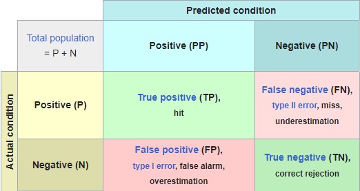
Accuracy Paradox can be seen if all data in ý moved from 1 to 0 (pos to neg) the accuracy rate could go up.
Cumulative Accuracy Profile (CAP) CAP curve analysis
- add example
- Curve/Area of perfect model (aᵨ) and curve/area of a good model (aᵣ). AR = aᵣ/aᵨ
- or look at 50% line on horz axis and look where it crosses the good model and get the value of vert axis there.
- 90-100% is too good (over fitting or one of the independent var is a post facto var and should be removed)
- 80-90% is very good
- 70-80% is good
- 60-70% is poor
- less 60% is bad
Unsupervised Learning
Unsupervised learning algorithms (identify patterns in unlabeled data). The models do not need to be supervised using a training set.
Supervised - you know what to predict
Unsupervised - you do not know what to predict
Grouped into two categories
- clustering
- association rule learning (ARL)
Clustering Model
Clustering works best with numerical data
K-means
- Decide how many clusters
- Place a randomly placed centroi
- K-Means will assign each of the data points to the closest centroid
- Calculate center of mass, move centroids, do process again
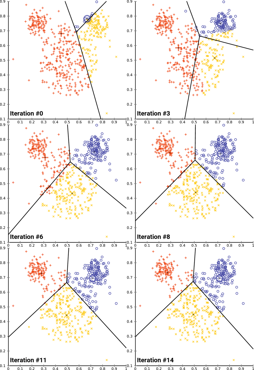
By Chire - Own work, CC BY-SA 4.0,
K-means++ takes extra steps in placing the initial centroid to avoid Random initialization trap. Uses weighted random approach below
- first centroid is chosen at random
- for each remaining data point compute the distance D to the nearest out of already selected centroids
- choose next centroid among remaining data points using weighted random selection, weighted by D^2
- Repeat 2-3 until all k centroids have been selected
Build clustering models
K-means Clustering Model
Most popular
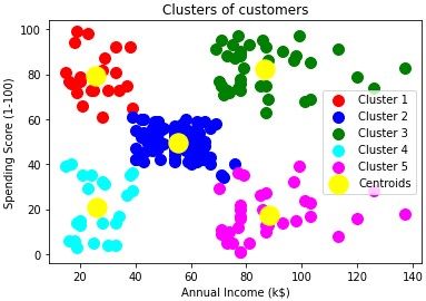
Background is that a team wants to understand their customers better and identify patterns.
Since it is not known what to predict will create the dependent variable. Creating it in such a way that each of the values of this future dependent vriable being created are actually the classes of this dependent variable.
There will not be a y var when importing. And will not split into training/test set since this implies a dependent var containg the real results. Which is not the case in this scenario.
wcss (within cluster sum of squares) - the sum of the square distances between each observation point of the cluster and its central width
Will use elbow method to find optimal number of clusters
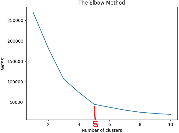
Code
dataset = pd.read_csv('Mall_Customers.csv')
X = dataset.iloc[:, [3:4]].values   # In tutorial only impored last 2 columns purely for 2D visualisation reasons

# Using the elbow method to find the optimal number of clusters
# Run the KMeans multiple times with varying number of clusters
# Using k-means++ to avoid random initialization trap
from sklearn.cluster import KMeans
wcss = []
for i in range(1, 11):
    kmeans = KMeans(n_clusters = i, init = 'k-means++', random_state = 42)
    kmeans.fit(X)  # Train each one on the dataset with different cluster sizes
    wcss.append(kmeans.inertia_)
plt.plot(range(1, 11), wcss)
plt.title('The Elbow Method')
plt.xlabel('Number of clusters')
plt.ylabel('WCSS')
plt.show()

# Use fit_predict method to train the K-means model on the dataset and return/create Y dependent y_kmeans
# chose 5 clusters based on elbow method
kmeans = KMeans(n_clusters = 5, init = 'k-means++', random_state = 42)
y_kmeans = kmeans.fit_predict(X)
print(y_kmeans) # Don't forget starts at 0. So value of 0 is the 1st cluster, etc

# Visualize the 5 clusters
# Call the X table where each row matches the cluster (y_kmeans == 0,1,2..)
# and then use col 0 for X and col 1 for Y (remember only used last 2 col of table)
plt.scatter(X[y_kmeans == 0, 0], X[y_kmeans == 0, 1], s = 100, c = 'red', label = 'Cluster 1')
plt.scatter(X[y_kmeans == 1, 0], X[y_kmeans == 1, 1], s = 100, c = 'blue', label = 'Cluster 2')
plt.scatter(X[y_kmeans == 2, 0], X[y_kmeans == 2, 1], s = 100, c = 'green', label = 'Cluster 3')
plt.scatter(X[y_kmeans == 3, 0], X[y_kmeans == 3, 1], s = 100, c = 'cyan', label = 'Cluster 4')
plt.scatter(X[y_kmeans == 4, 0], X[y_kmeans == 4, 1], s = 100, c = 'magenta', label = 'Cluster 5')
plt.scatter(kmeans.cluster_centers_[:, 0], kmeans.cluster_centers_[:, 1], s = 300, c = 'yellow', label = 'Centroids')
plt.title('Clusters of customers')
plt.xlabel('Annual Income (k$)')
plt.ylabel('Spending Score (1-100)')
plt.legend()
plt.show()
How to use the data
Could target high income/high spending cluster with new deals
Brainstorm ways of reaching high income/low spending cluster
Hierarchical Clustering Model
Two types
- Agglomerative (bottom up)
- Divisive (top down)
Will use Agglomerative
- Make each daa pt a single point cluster - that forms N clusters
- Take the two closest data points and make them one cluster - That form N-1 cluster
- Take the two closest data points and make them one cluster - That form N-2 cluster
- Repeat step 3 until there is only one cluster
Important aspect is closeness of clusters
- For 2 points on a 2D plane have been using euclidean distance sqrt(x^2+y^2)
- For clusters can use distance of ..
- closest points
- furthest points
- average distance
- centroids
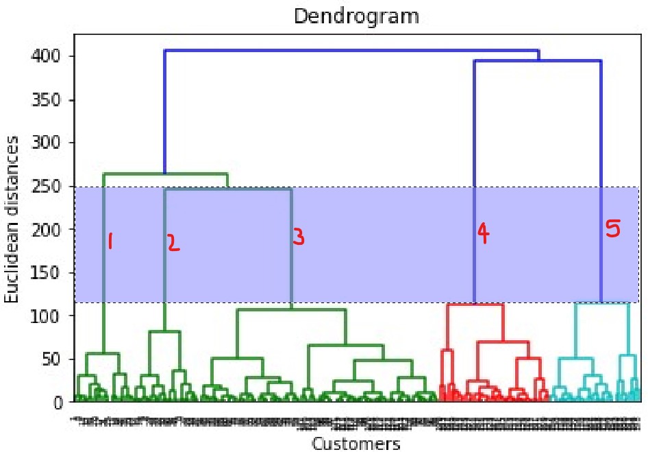
Dendogram acts as the memory of the algorithm and will remember the steps of clustering to get the final result. Will build it first to find the optimal number of clusters. Hierarchical clustering metric uses within cluster variance.
Find the largest vertical distance between horiz lines and then count the clusters
dataset = pd.read_csv('Mall_Customers.csv')
X = dataset.iloc[:, [3, 4]].values   # only importing last 2 col to make visualizing easier

# Build dendogram
import scipy.cluster.hierarchy as sch
dendrogram = sch.dendrogram(sch.linkage(X, method = 'ward')) # use method of minimum variance
plt.title('Dendrogram')
plt.xlabel('Customers')  # X axis is observations or rows
plt.ylabel('Euclidean distances')
plt.show()

# Fit hierarchal class model using 5 clusters
from sklearn.cluster import AgglomerativeClustering
hc = AgglomerativeClustering(n_clusters = 5, affinity = 'euclidean', linkage = 'ward')
y_hc = hc.fit_predict(X)  # fit and predict model

plt.scatter(X[y_hc == 0, 0], X[y_hc == 0, 1], s = 100, c = 'red', label = 'Cluster 1')
plt.scatter(X[y_hc == 1, 0], X[y_hc == 1, 1], s = 100, c = 'blue', label = 'Cluster 2')
plt.scatter(X[y_hc == 2, 0], X[y_hc == 2, 1], s = 100, c = 'green', label = 'Cluster 3')
plt.scatter(X[y_hc == 3, 0], X[y_hc == 3, 1], s = 100, c = 'cyan', label = 'Cluster 4')
plt.scatter(X[y_hc == 4, 0], X[y_hc == 4, 1], s = 100, c = 'magenta', label = 'Cluster 5')
plt.title('Clusters of customers')
plt.xlabel('Annual Income (k$)')
plt.ylabel('Spending Score (1-100)')
plt.legend()
plt.show()
Association Rule Learning (ARL)
Apriori (ARL)
People who bought also bought .. Can you prove the result by using some prior knowledge
Support, Confidence, Lift steps
- set a minimum support and confidence
- support: the support of A and B is the number of transactions containg A and B divided by total num of transactions
- confidence: can start with 0.8 and then lower if not enough rules returned
- take all the subsets in transactions having higher support than minimum support
- take all the rules of these subsets having higher confidence than minimum confidence
- sort the rules by decreasing lift
- lift: most relevant metric tomeasure the strength of a rule. the quality or relevance of a rule (confidence/support). good value is at least 3. below 3 and rule is not that relevant.
Lift is the metric for measuring the relevance of an association rule
Association rules inside an ensemble of transactions. Note since this is association rules there is no training/test set or dependent variable
!pip install apyori # have to install apyori package

dataset = pd.read_csv('Market_Basket_Optimisation.csv', header = None)
transactions = []
for i in range(0, 7501): # data is rows of transactions so load into a list
  transactions.append([str(dataset.values[i,j]) for j in range(0, 20)])

# Train apriori model on dataset
"""
transactions: list of items created above
min_support: support for each rule. only compute rules with min support value.
             There were 7501 transactions weekly.
             Let's say we only want to consider products that appear in at least 3 transactions/day or 21/weekly.
             So 21/7501 = ~3%
min_confidence: started with 0.8 but no rules returned. trial and error showed 0.2 returned decent number of rules
min_lift:  3 or above indicated a decent rule quality/relevance

Customer wanted scenarios of buy A and get B free. so 1 product on left hand side and 1 product on right hand side. Total of exactly 2.
min_length: min number of elements you want to have in your rule. left to right
max_length: max number of elements you want to have in your rule. left to right

If wanted to do flexible scenarios. But BOGO and buy 10 get 1 free. Then min=2 and max=11
"""
from apyori import apriori
rules = apriori(transactions = transactions, min_support = 0.003, min_confidence = 0.2, min_lift = 3, min_length = 2, max_length = 2)

# apriori returns a generator. generator is a function that returns an iterator. An iterator is an object that can be used to iterate over a sequence of values.

results = list(rules) # cast results from apriori to a list
results # print out
"""
[elationRecord(items=frozenset({'chicken', 'light cream'}), support=0.0045, ordered_statistics=[OrderedStatistic(items_base=frozenset({'light cream'}), items_add=frozenset({'chicken'}), confidence=0.290, lift=4.84)]), [...]
"""
# If customer buy light cream will have 29% chance of buying chicken (confidencee)
# The rule containing these 2 products appears in 0.45% of the transactions (support)


# Organize the results list into a df
def inspect(results):                               # step through all items in list
    lhs         = [tuple(result[2][0][0])[0] for result in results] #
    rhs         = [tuple(result[2][0][1])[0] for result in results]
    supports    = [result[1] for result in results]
    confidences = [result[2][0][2] for result in results]
    lifts       = [result[2][0][3] for result in results]
    return list(zip(lhs, rhs, supports, confidences, lifts)) # takes two or more lists as arguments and returns a list where the elements of the same index in the lists are paired together
resultsinDataFrame = pd.DataFrame(inspect(results), columns = ['Left Hand Side', 'Right Hand Side', 'Support', 'Confidence', 'Lift'])

# Display results non sorted
resultsinDataFrame

# Display the results sorted by descending lifts
resultsinDataFrame.nlargest(n = 10, columns = 'Lift')

"""
Looking at highest lift indicates people who bought fromage blanc had a 24.5% change of buying honey.

Left Hand Side	    Right Hand Side	Support	    Confidence  Lift
3	fromage blanc	honey	        0.003333	0.245098	5.164271
0	light cream	    chicken	        0.004533	0.290598	4.843951
2	pasta	        escalope	    0.005866	0.372881	4.700812
8	pasta	        shrimp	        0.005066	0.322034	4.506672
"""

# To get all items into a single dataframe column
allTrans = pd.DataFrame({'items':transactions}) # each dataframe row will be a list which can be exploded in next step
allTrans = allTrans.explode('items').replace('nan', np.nan).dropna()  # replace the nan with NaN and drop them

from matplotlib.ticker import PercentFormatter

itemCounts = allTrans['items'].value_counts() # get counts of the values. this returns a pandas series so convert to df in next step
itemCounts = itemCounts.to_frame().reset_index() # convert series to df

itemCounts.columns = ['items', 'count']  # rename option was not working so used .columns to oupdate column names

# calculate the cumulative percent of each unique item
itemCounts['cumperc'] = itemCounts['count'].cumsum()/itemCounts['count'].sum()*100
print(itemCounts)
print(itemCounts.columns)

# use nlargest to get the top 10 'count' values
top10 = itemCounts.nlargest(n=10, columns='count' )
#top10['items'].value_counts().plot(ax=ax, kind='bar')  # if didn't need top 10 could just plot all counts of items without using nlargest
#top10.plot(ax=ax, kind='bar')  # some quick plotting for simple bar chart

# to get bar plot with cumulative line chart
#define aesthetics for plot
color1 = 'steelblue'
color2 = 'red'
line_size = 4

df = top10
#create basic bar plot
#plt.rcParams["figure.figsize"] = [7.50, 3.50]
#plt.rcParams["figure.autolayout"] = True
fig, ax = plt.subplots()
ax.bar(df['items'], df['count'], color=color1)
plt.xticks(rotation=90)

#add cumulative percentage line to plot
ax2 = ax.twinx()
ax2.plot(df.index, df['cumperc'], color=color2, marker="D", ms=line_size)
ax2.yaxis.set_major_formatter(PercentFormatter())

#specify axis colors
ax.tick_params(axis='y', colors=color1)
ax2.tick_params(axis='y', colors=color2)

#display Pareto chart
plt.show()

"""
plt. subplots() is popular because it gives you an Axes object and allows you to use the Axes interface to define plots.
fig, axes = plt.subplots(nrows=2, ncols=3)  # default args is 1, 1
  fig is the figure object
  axes is a list of axes objects, one for each subplot
  nrows is the number of rows in the grid
  ncols is the number of columns in the grid

The line of code fig, ax = plt.subplots() is a shortcut for creating a new figure and a set of subplots. The fig refers to the entire figure or window that contains the plot(s).
 The ax refers to the axes, which are the canvas you draw on.
 The subplots() method provides a way to plot multiple plots on a single figure.
You can use plt.subplots() to make all their subplots at once. It returns the figure and axes as a tuple. For example, fig, ax = plt.subplots(2,1) creates a subplot with 2 rows and 1 column.

"""
Eclat (ARL)
Similar to apriori, if you like A you might like B
But instead of lift describing the strength of a rule will only consider support in terms of sets. For A,B,C take transactions containing products A,B,C divided by total num of transactions
usually would just use apriori instead of eclat
# follow apriori instructions
# just remove confidence and lifts
# and since there are no rules replace with Product1 and Product2. not considering left vs right hand side

def inspect(results):
    lhs         = [tuple(result[2][0][0])[0] for result in results]
    rhs         = [tuple(result[2][0][1])[0] for result in results]
    supports    = [result[1] for result in results]
    return list(zip(lhs, rhs, supports))
resultsinDataFrame = pd.DataFrame(inspect(results), columns = ['Product 1', 'Product 2', 'Support'])

# Display by descending supports
resultsinDataFrame.nlargest(n = 10, columns = 'Support')
"""
    Product 1	    Product 2	    Support
4	herb & pepper	ground beef	    0.015998
7	whole wheat pasta	olive oil	0.007999
2	pasta	        escalope	    0.005866
1	mushroom cream sauce	escalope	0.005733
5	tomato sauce	ground beef	    0.005333
8	pasta	        shrimp	        0.005066
0	light cream	    chicken	        0.004533
3	fromage blanc	honey	        0.003333
"""
Reinforcement Learning
Branch of ML moving in direction of AI and robotics. Used to solve interacting problems where the data observed up to time t is considered to decide which action to take at time t + 1. It is also used for Artificial Intelligence when training machines to perform tasks such as walking. Desired outcomes provide the AI with reward, undesired with punishment. Machines learn through trial and error.
Upper Confidence Bound (UCB)
UCB is a deterministic algorith. Choose the path with the highest upper confidence bound.
multi-armed bandit problem
- we have D arms. Arms are ads that we display to users each time they connect to a web page
- each time a user visits this page, that’s a round.
- at each round “n”, we choose one ad to display.
- at each round n, ad i gives reward ri(n) {0,1}: ri(n)=1 if the user clicked on the ad i, 0 if the user didn’t
- our goal is to maximize the total reward we get over many rounds
Confidence Intervals used for
- Differences between population means or proportions
- Estimates of variation among groups
Scenario with ads
UCB will select an ad to show to the user and will record if they click yes (1) or no (0)
Simulation dataset has 10k users with which ads they would click on
Will compare UCB vs Thompson to see which one is fastest at finding the best ad real-time
dataset = pd.read_csv('Ads_CTR_Optimisation.csv')

# Implementing UCB
import math
N = 10000   # Can vary this number to see how fast the UCB can find the ad with the highest click rate. (needed more than 500)
d = 10     # 10 different designed ads. Important assumption there is a fixed conversin rate
ads_selected = []  # Will populate over the rounds which one was selected. At the end will contain all the different ads selected at each round.
numbers_of_selections = [0] * d # List of Ni(n)
sums_of_rewards = [0] * d       # List of Ri(n) Accumulated rewards for each of the ads
total_reward = 0
for n in range(0, N):   # Loop through all users n=user
                        # General concept is to select the ad with the highest conversion rate/max UCB
    ad = 0
    max_upper_bound = 0
    for i in range(0, d):
        if (numbers_of_selections[i] > 0):  # if ad dealing with has already been selected do Step 2 calcs
            average_reward = sums_of_rewards[i] / numbers_of_selections[i]        # Step 2 calculation
            delta_i = math.sqrt(3/2 * math.log(n + 1) / numbers_of_selections[i]) # Step 2 confidence interval
            upper_bound = average_reward + delta_i                                # Calculate UCB
        else:
            upper_bound = 1e400  # By setting upper_bound to ~infinity will make sure each ad is cycled thru
                                        # Trick to make sure all ads are cycled thru (should occur in first 10 rounds)
        if upper_bound > max_upper_bound:   # Check if new max upper bound has been found
            max_upper_bound = upper_bound   # Step 3
            ad = i                          # Update ad to reflect this new ad with higher UCB
    # Update
    ads_selected.append(ad) # full list of all the ads selected over the rounds
    numbers_of_selections[ad] += 1 # increment the number of selections for that ad so far
    reward = dataset.values[n, ad]  # Access the data set and get the value for the user or n and ad (row/col). 0 or 1
    sums_of_rewards[ad] = sums_of_rewards[ad] + reward
    total_reward = total_reward + reward

# Visualize results
# Should show which ad was getting the highest click rate so the UCB started selecting it more
# Vary the N value above to see how fast it can still identify the ad with highest click rate (needs more than 500 users)
plt.hist(ads_selected)  # the sequence of ads that were selected over the rounds. list of 10k elements
plt.title('Histogram of ads selections')
plt.xlabel('Ads')
plt.ylabel('Number of times each ad was selected')
plt.show()
Thompson Sampling
Thompson sampling is a probabilistic algorithm. Consists of choosing the action that maximizes the expected reward with respect to a randomly drawn belief. But not trying to guess the distributions. Trying to mathematically explain what we think is going on.
- Create a hypothetical point that we think will be our expected return
- Take action that will trigger the distribution to spit out a real world value
- Adjust the models perception to incorporat the new value
- Will trigger more refining on the best option
dataset = pd.read_csv('Ads_CTR_Optimisation.csv')

import random
N = 10000   # Can vary this number to see how fast
d = 10     # 10 different designed ads. Important assumption there is a fixed conversin rate
ads_selected = [] # Will populate over the rounds which one was selected. At the end will contain all the different ads selected at each round.
numbers_of_rewards_1 = [0] * d # Ni^1(n) number of times the ad i got reward 1, up to round N
numbers_of_rewards_0 = [0] * d # Ni^0(n) number of times the ad i got reward 0, up to round N
total_reward = 0
for n in range(0, N):  # General concept is to select the ad with the highest conversion rate
    ad = 0
    max_random = 0
    for i in range(0, d):   # betavariate will return random draw from the beta distribution 0-1
        random_beta = random.betavariate(numbers_of_rewards_1[i] + 1, numbers_of_rewards_0[i] + 1)
        if random_beta > max_random:
            max_random = random_beta
            ad = i
    ads_selected.append(ad)
    reward = dataset.values[n, ad]
    if reward == 1:
        numbers_of_rewards_1[ad] = numbers_of_rewards_1[ad] + 1
    else:
        numbers_of_rewards_0[ad] = numbers_of_rewards_0[ad] + 1
    total_reward = total_reward + reward

# Can find the optimal ad (highest conversion rate) in less than 500 rounds. UCB required 500 or more.

# Visualize
plt.hist(ads_selected)
plt.title('Histogram of ads selections')
plt.xlabel('Ads')
plt.ylabel('Number of times each ad was selected')
plt.show()
UCB vs Thompson Sampling
UCB
- deterministic algorithm. When you get a value you look at the upper confidence bound and continue with the one that is highest. There’s no randomness in the algorithm itself.
- If you rerun an iteration in the UCB algorithm after receiving the previous value it will always give the same result.
- Requires update at every round. Can not proceed to next round until you incorporate the value
Thompson
- probabilistic alogrithm. In the algorithim itself it has distributions which represent where we think the actual expected returns are. Therefore every time we iterate we generate random values from those distributions.
- If you rerun an iteration after receiving the previous value it will always be different becaues we’re sampling from the distributions which characterize our perception of the world.
- Does not require update each round. Can accommodate delayed feedback. Can update in a batch manner. If for some reason you will not know the results until 100 rounds later you can still run the algorithm because you’ll get a new set of hypothetical results generated in a probabilistic manner (even without updating your perception of the world).
